January 18, 2023
Why it’s good to be odd
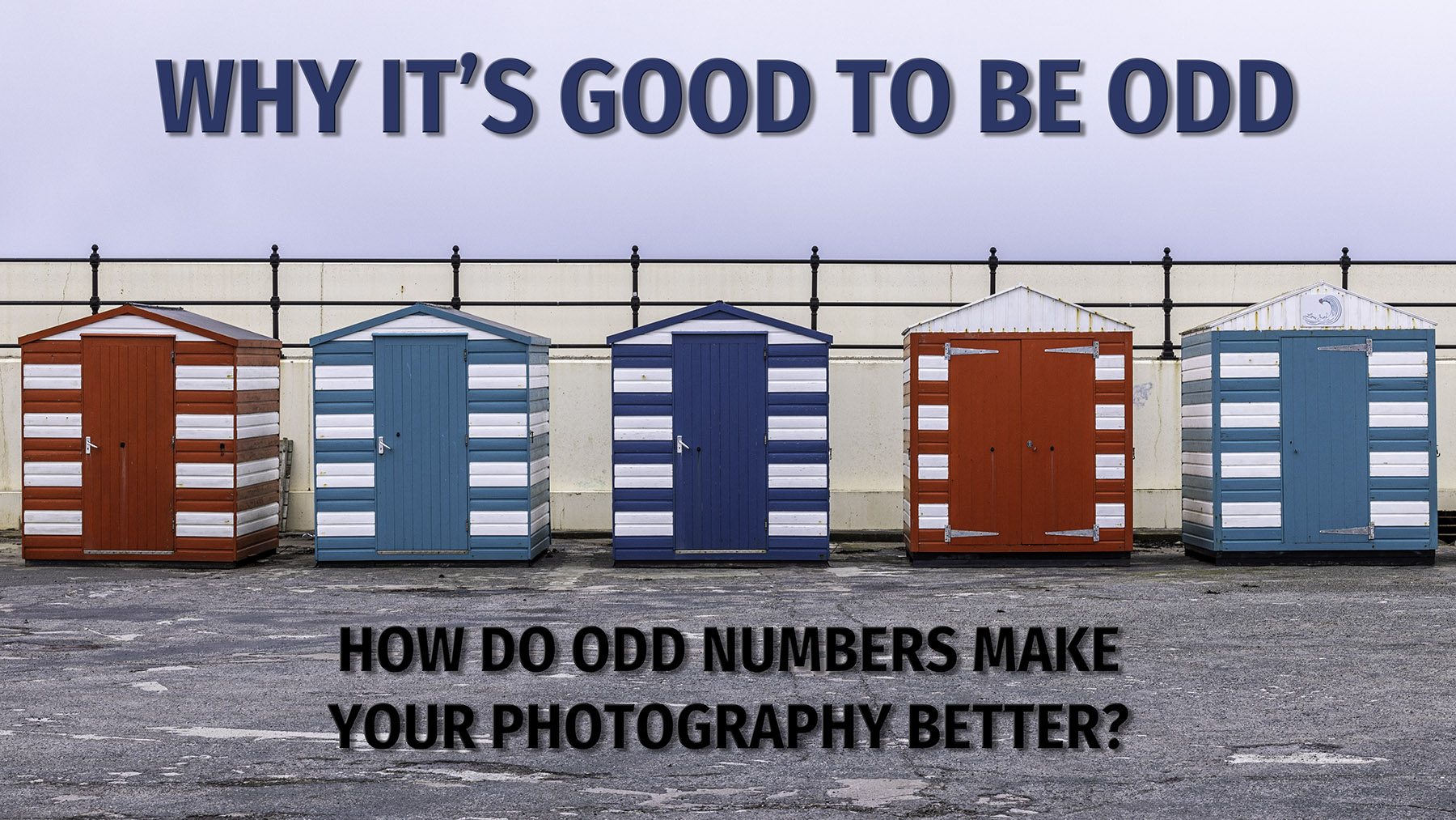
Using 3, 5 or 7 things in a photo can make it more appealing. How odd numbers create more connection in your pictures

You’ve probably all heard of the rule of thirds. It’s one of the first composition techniques used in art or photography. But did you know there’s another numerical composition process that can make your photos stand out? The rule of odds works by adding an odd number of things in a picture to make it feel more appealing.
How does the rule of odds work?
We’re going to head into the world of psychology. This means there isn’t a correct provable answer. Instead, we can use theories to understand why people prefer to look at things grouped in odd numbers rather than even numbers. There are two photos below of the same subject. Which do you prefer – the one with three huts or four?
If you prefer the one with four, you’re probably best stopping here. However, keep going if you like the version with the odd number of huts. There are various theories about how our minds process an image that leads us to like odd numbers. A good one I have seen is that our brain likes to group things together. Four items are easy to group into two sets of two or one set of four. However, the odd number of subjects can’t be grouped so easily. It could be three individual items, a group of three or two variations of two and one. The odd number makes our brain work a little harder, and it, therefore, keeps us interested. Think about how many groups you can make out of five items in a shot.

Three is the magic number
When working with a group of people, I tend to find that I am drawn to using threes in the shot. The three examples below (see what I did there) all contain groups of three. Whether it’s the two girls flanking the Chinese dragon, the three bottles of gin or the three computer programmers, they are all creating the tension caused by our brains trying to group them in different ways.
Can you be too odd?
That’s a question I often ask myself. I find that getting to 7 of something is about as far as our brains can process without getting overly confused by the picture. I was at the Yorkshire Sculpture Park a few weeks ago. This is a segment of a work by Lakwena Maciver called ‘A green and pleasant land (HA-HA). It repeatedly repeats the words Ha Ha on a wall in different colours and fonts. By its nature, it has to have an even number of squares – the original is 18 squares wide by six high. However, when I photographed the segment, I was drawn to creating a grid seven squares wide by five squares high. It felt right visually and contained just enough information to get over the concept. I think that if I had increased the number anymore that it would have lost the visual impact – what do you think?

Please give us your feedback.
If you’ve got any questions or comments, leave them below. You can sign up for the Edinburgh Photography Workshop monthly newsletter, where you’ll get regular updates on exciting things happening in photography and some great tips. Sign up by clicking here.
About the author
As well as running Edinburgh Photography Workshop, Rich Dyson is a professional photographer. His photographs are regularly used in newspapers such as The Times, Guardian and Daily Telegraph. He also had two solo exhibitions and was featured in a members-sponsored exhibition in the Scottish Parliament. You can see and buy his photography at richdysonphotography.com.