February 22, 2023
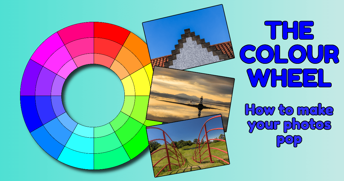
Understanding the colour wheel
A great technique for improving composition in your photography is the use of the colour wheel. What is it, and why does it help?
From the earliest days of photography, Edinburgh has been closely connected with the development of the craft. Starting with David Octavius Hill and Robert Adamson, who created a large body of work just four years after the invention of photography. James Clerk Maxwell then identified that all variations of colour could be obtained by mixing red, green and blue light. Using this discovery, he could reproduce a full-colour projection of a tartan ribbon in 1861. With the introduction of colour photography and subsequent developments, we can now capture the world in the same way we see it – the world wasn’t black and white until the 1950s!
What is colour?
Before we look at how we use colour in our photography, let’s understand what colour is. As Clerk-Maxwell identified, all colour is a combination of the three Prime Colours, red, green and blue. Variations of these colours can be made by adjusting the hue, saturation or brightness. We can understand this more by looking at a concept discovered by Sir Isaac Newton in 1666 called ‘the colour wheel’.

Hue
If we look at the outer band of the wheel, we can see it is split into twelve segments. There are 360 degrees in a circle, and we will start splitting them into these twelve segments. Starting from the top at 0°, we have the colour red. At 120°, we have the colour green, and at 240° is the colour blue – these are the primary colours later discovered by Clerk Maxwell.
Between the primary colours, we have three segments. The middle segment of the three is what we refer to as the secondary colours. These are yellow (a mix of red and green), cyan (a mix of green and blue) and magenta (a mix of blue and red).
The remaining six colours on the outer band are tertiary colours, which is a mix of the two colours on either side of them. These are known as orange, chartreuse, spring green, azure, violet and rose. You could, of course, divide the wheel into more and more segments which would affect the hue (or wavelength) of these colours.
Saturation
We can change the primary, secondary and tertiary colours by changing the saturation applied to the colour. Saturation is the amount of white light mixed with a hue. The outer ring has no white light mixed with the hue. In the second ring from the outside, the saturation has been reduced by 20% of the outer ring. The third ring has had the saturation reduced by a further 20%. As you can see above, this produces different shades.
Brightness
Brightness can be defined as the intensity of light created by mixing the outer colours with shading. It’s best seen by taking one of the segments and imagining that the colour wheel is now a tube. The tube’s height applies different brightness levels to it to create yet more colours. The top segment is the red primary colour, and then two layers below it have 20% more shadow applied each time.

Combining the hue, saturation, and brightness can create thousands, maybe even millions, of different colour combinations. Just using 360° of hue with 100 percentiles of saturation and brightness, there are 3,600,000 colours that we can use in editing programs such as Adobe Photoshop!
Let’s simplify things and return to our original colour wheel with the twelve exterior colours and the two inner rings. We can use these combinations of these colours to create an interesting composition by following a few simple rules.
Complementary Colours
Colours directly on opposite sides of the colour wheel are known as complimentary colours. By combining these two colours in images, we can create contrast and impact, which helps to make our photograph stand out. Think about how distinctive the Ukrainian flag is. The combination of a blue and yellow band in the flag straddles two sides of the colour wheel. However, we can often see complementary colour combinations as we walk around. The image below, taken on a Switch to Manual workshop, shows a combination of the orange colours on the roof and the sky’s azure colour. A simple composition stands out by using the opposing sides of the colour wheel.

Dominant and Recessive Colours
With all the millions of colour combinations we can see or create, certain colours will tend to stand out more. These are known as dominant colours and will be able to continue to draw attention regardless of the other colours around them. The primary colours of red, green and blue are often seen as dominant colours. In the image below, the red flowers stand out against the lesser saturated green background and create a strong visual to latch onto. Colours with less saturation tend to be less dominant and act as a good background for solid and dominant colours.

Triadic Colours
Similar to complementary colours, triadic colour schemes will produce strong colour palettes. The principle of this technique is to use three colours that are evenly spaced on the colour wheel. Combining red, green and blue into this scene at Jupiter Artland creates a vibrant image.

Monochromatic Colours
We are used to referring to black and white photographs as monochromatic. However, we can also use a similar palette of colours to create an image that uses different shades of the same colour. In the colour wheel, this would mean using images that go in a straight line from the outside edge of the colour wheel toward the centre. This photograph of the Perch Light at Port Glasgow uses different tints of yellow to create a calming feel to the image.

Please give us your feedback.
If you’ve got any questions or comments, leave them below. You can sign up for the Edinburgh Photography Workshop monthly newsletter, where you’ll get regular updates on exciting things happening in photography and some great tips. Sign up by clicking here.
About the author
As well as running Edinburgh Photography Workshop, Rich Dyson is a professional photographer. His photographs are regularly used in newspapers such as The Times, Guardian and Daily Telegraph. He also had two solo exhibitions and was featured in a members-sponsored exhibition in the Scottish Parliament. You can see and buy his photography at richdysonphotography.com.