November 28, 2018
Colour Pop Photographs
How to achieve the Schindler’s List effect of a colour pop.
This week, as well as reading my words, you’ll have the opportunity to listen to my dulcet tones and watch as I show you how to create a colour pop image. You’ve probably seen the effect in the film Schindler’s List where the director showed a girl in red walking the streets whilst the rest of the scene is in black and white. You can read the transcript of the video below.
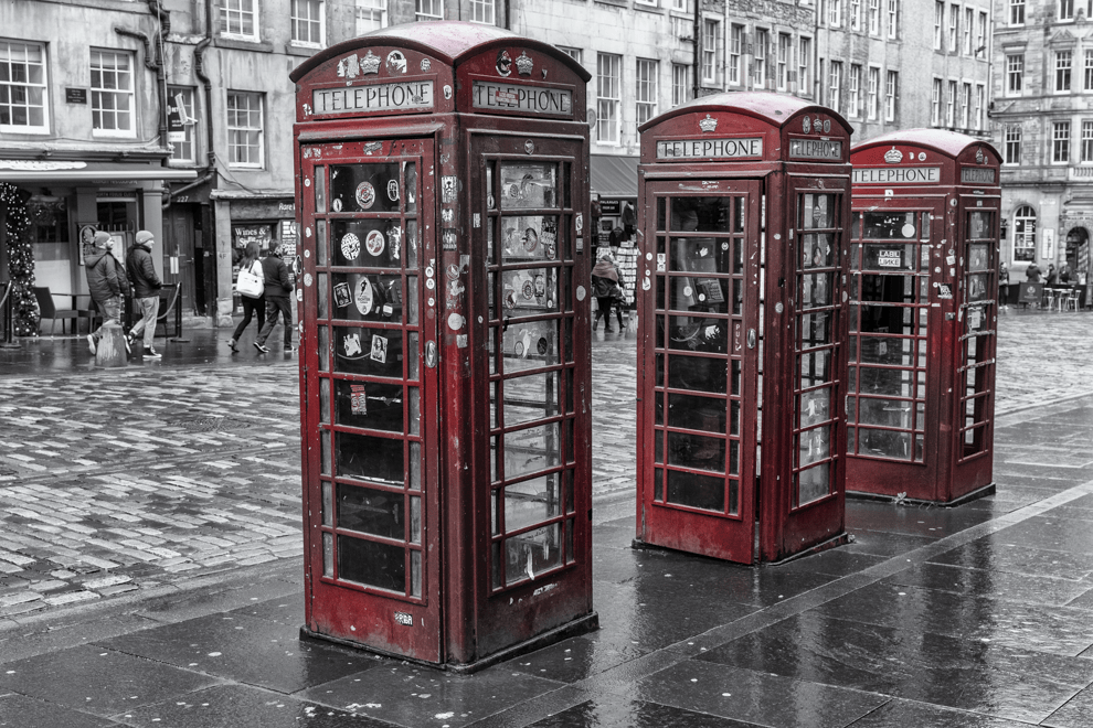
We are going to use this image taken on one of my Switch to Manual workshops. These three phone boxes make a nice image in colour. They are also a really great subject for a colour pop. The image starts off in Lightroom but most of the work is going to be done in a piece of software called Silver Efex Pro which is part of the Nik Collection from DxO
Lightroom Edits
We’ll start off in Lightroom with my 20-second edit. I’ll add the preset which adds 25% clarity and 35% vibrance as well as adding lens corrections. We’ll then click on Auto in the tone section. We’ve got a pretty good image to start off with.
We are now going to take this photograph over into Silver Efex Pro. When you first install the suite you are given the option of integrating Silver Efex Pro into Lightroom. I can right click on the image and then take the options, Edit and then Edit in Silver Efex Pro.
The dialog box that pops up has one option, so we’ll simply click OK and let it open in Silver Efex Pro.
Silver Efex Pro global edits
The Silver Efex Pro interface looks quite similar to Lightroom’s Develop module. On the left, we have a series of presets. For example, this one gives an over-exposed look by adding 1 stop of exposure. The one I think works well with this image is High Structure (Harsh) which gives quite a nice contrasty feel.
On the right of the screen are a series of sliders where we can change the image. We can change the entire brightness of the image and also affect just the highlights, shadows and midtones. I’ll darken the image ever so slightly and also reduce the brightness of the shadows.
There are other sliders for Contrast and Structure which work in a similar way. However, I’m quite happy with the image as it is now.
At the bottom of the sliders we can also make changes to the tone of the image, for example, we can give the image a sepia look. The one I think works best with this image is Selenium, which gives a nice silver tint to the image.
Colour pop using selective adjustments
Everything we have done so far has affected the entire image. Now we are going to only edit the elements which are red in the image. We do this with something called Selective adjustments. You can see that the cursor is currently an arrow. When I click on the Control Point tool it now changes to a target. I’m going to put it onto one of the red parts of the phone boxes and left click. You can see a new menu has appeared on the image which is going to now only work on things that are the same colour as of where the control point is.
If I move the top slider it will increase or decrease the area that the effect will work on. I’m going to make it as big as possible, so anything which is red will get affected. I’ll move the brightness slider to the right and the red elements get brighter. Move to the left and the red parts get darker. I’ll leave it around 5% darker. I can also change the contrast and structure in a similar way.
At the bottom of these menu items is a little downward pointing pyramid. If I click on that then additional menu items are now available. The one we want to use is the bottom slider which is called Selective Colourisation. Move the slider to 100% and you can see everything that is red now has the colour applied. That’s kind of what we want except in the left we can see that shop fronts are also red.
In order to only change the phone boxes colour, we’ll make the area of the effect smaller. That’s fixed the shop-fronts but now we haven’t got all the phone boxes covered. To keep all the settings that we have changed in the sub-menu we can click on this symbol which duplicates the control point and we can then move it to another point in the shot which is red. I’ll keep on duplicating the points until we have the parts of the box that is red.
Now that we’ve finished all we need to do is click on Done and the Colour Pop image is taken back into Lightroom.
I hope you’ve enjoyed this slightly different blog this week. I’d love to get any feedback on what you’d like to see in future blogs. Just drop an e-mail to contact@edingburghphotographyworkshop.com